Recently Released.
Newly Released in the last 30 days


Paginating our Course List
In this lesson, we'll transform our courses list endpoint into a pagination endpoint. We'll check and validate our query string for a page and per page parameter that we'll then use to fetch pages of our courses.

Creating, Updating, and Deleting Courses
In this lesson, we'll add endpoints to allow creating, updating, and deleting courses from our API. We'll then use this to stub a number of test courses to give us wiggle room to play with our pagination.


Listing Courses
Our goal in this step is to add an endpoint that lists our courses. We'll then build upon this endpoint further with the ultimate goal of getting a list of paginated courses.

API Authorization Checks
In this lesson, we'll implement our API Authorization checks across all the API controller methods we've implemented thus far. We'll then create a specific access token for each operation (read, create, update, and delete) to ensure everything is working.

Status API CRUD
In this lesson, we'll duplicate everything we did one more time for our organization's statuses.

Access Level API CRUD
In this lesson, we'll walk through adding API endpoints for the full CRUD (create, read, update, and delete) flow for our organization's access levels.
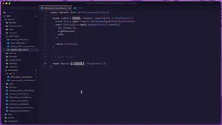

Deleting A Difficulty
The last CRUD method we need to add is the ability to delete our a difficulty by adding a DELETE API route, we'll take care of that in this lesson.
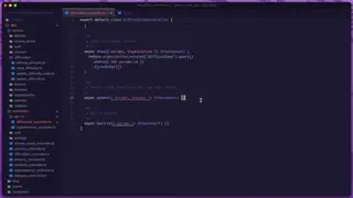

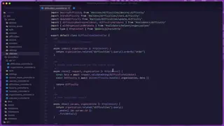
Updating A Difficulty
In this lesson, we'll add a PUT API route to handle updating our difficulties! This route will also accept in a specific difficulty id via route parameter to specify which difficulty should be updated.

Getting A Specific Difficulty
In this lesson, we'll add a GET API route enabling us to get the details of a specific difficulty by providing the difficulties id via route parameter.

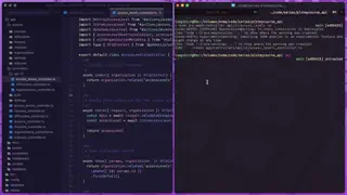
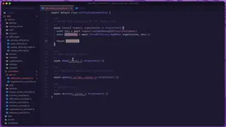
Creating Organization Difficulties
Next, we'll add a POST route and handler so that we can create difficulties from our API

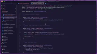
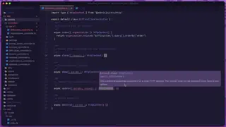
Listing Organization Difficulties
In this lesson, we'll begin work on our first CRUD-based API resource by adding the ability to query a list of all our organization's difficulties.
Lessons.


Paginated Admin Movie Table
In this lesson, we'll learn how we can create a paginated movie table for our administrators. We'll list the movies and some of their relationship data, like the number of crew and cast members associated with the movie.


Using Dependency Injection to Update A User's Profile
In this lesson, we'll learn how to allow users to edit their profiles. We'll also cover how we can inject the HttpContext into a service instance using Dependency Injection (DI).


Creating An EdgeJS Form Input Component
In this lesson, we'll create a form input component with EdgeJS to simplify adding inputs throughout our application and to extract away old value and validation error logic.

Easy SVG Icons with Edge Iconify
In this lesson, we'll learn how we can install and use the edge-iconify package giving us super easy access within our EdgeJS files to any of the SVG icon packages available through Iconify.


Component Tags, State, and Props
In this lesson, we'll learn how to use EdgeJS components within AdonisJS as direct tags. We'll also learn about our component's state and props


Use Slots To Make A Button Component
In this lesson, we'll learn about EdgeJS component slots by making a versatile button component that can gracefully handle both links and button types.


Extracting A Layout Component
In this lesson, we'll learn how we can create EdgeJS layouts using components so that we don't have to redefine or HTML structure for every page in our application.


Making A Reusable Movie Card Component
In this lesson, we'll learn how we can make a movie card component with EdgeJS that we can define once and easily use throughout our markup.


Form HTTP Method Components
In this lesson, we'll create helper HTTP Method form components, further simplifying our method spoofing by allowing us to just chain the desired method off our form component.


Form Component Method Spoofing
In this lesson, we'll add simplified HTTP Method Spoofing functionality to our base form component. With this simplified functionality all we'll need to do is specify the desired HTTP Method to the method prop and it'll add it to our URL.


Form Utility Component
In this lesson, we'll start a form utility component. This component will allow us to create one central location where we can maintain our forms and provide additional functionality like simplified method spoofing.


Bordered, Active Bordered, and Plain Variants
In this lesson, we'll split out three different variants from the accordion item we made in the last lesson. We'll create bordered, active bordered, and plain accordion items.


Identifying Accordion Items
In this lesson, we'll add the ability to have more than one item on a given accordion by creating a new accordion item component.


Starting Our Accordion
In this lesson, we'll start our accordion component and gain an understanding of how to handle uniquely identifying components that may appear multiple times on a single page via the AlpineJS magic id utility.


Dismissible & Self Destructing Alerts
In this lesson, we'll focus on adding interactivity to our alerts by making them both conditionally dismissible and self-destructable.


Inverse Alert Style & Cascading Slots
In this lesson, we'll add our alert's inverse styling by extending our base alert. We'll also see how to cascade slots passed into our inverse alert to our extended base alert.


Adding Conditional Icon, Headline, and Message Content
In this lesson, we'll make our alert's icon, headline, and message completely optional. We'll also allow our icon to be provided via slot and our headline and message via prop or slot.


Adding Alert Variants
In this lesson, we'll focus on adding a light, dark, blue, green, red, and yellow variant option to our base alert.


Creating Our Base Alert
In this lesson, we'll create our base alert to serve as our building block for our content, variant, and style options. We'll also fix a pseudo-selector issue.


Adding Button Inverse and Outline Styles
In this lesson, we'll add two new button style options, inverse and outline. Both styles will extend off the work we did with our base button to keep all functionality in one concise location
Showing 1 to 20 of 34 results