
Next for our alert, let’s add the inverse style option. This process will be fairly similar to our buttons, however, as you’ll see in a bit we’ll need to figure out a way to cascade our props into our base alert component.
Stubbing Our File
First, let’s create the component file our inverse alert style will reside within
touch resources/views/components/alert/inverse.edgeCopied!
Getting the Inverse Variant Classes
Then, let’s grab the HTML markup from the PinesUI documentation for the inverse alert styling, or you can grab it from below.
<div class="relative w-full rounded-lg border border-transparent bg-blue-50 p-4 [&>svg]:absolute [&>svg]:text-foreground [&>svg]:left-4 [&>svg]:top-4 [&>svg+div]:translate-y-[-3px] [&:has(svg)]:pl-11 text-blue-600"> <svg class="w-5 h-5 -translate-y-0.5" xmlns="<http://www.w3.org/2000/svg>" fill="none" viewBox="0 0 24 24" stroke-width="1.5" stroke="currentColor"><path stroke-linecap="round" stroke-linejoin="round" d="M11.25 11.25l.041-.02a.75.75 0 011.063.852l-.708 2.836a.75.75 0 001.063.853l.041-.021M21 12a9 9 0 11-18 0 9 9 0 0118 0zm-9-3.75h.008v.008H12V8.25z" /></svg> <h5 class="mb-1 font-medium leading-none tracking-tight">Alert Message Headline</h5> <div class="text-sm opacity-80">This is the subtext for your alert message, providing important information or instructions.</div> </div> <div class="relative w-full rounded-lg border border-transparent bg-red-50 p-4 [&>svg]:absolute [&>svg]:text-foreground [&>svg]:left-4 [&>svg]:top-4 [&>svg+div]:translate-y-[-3px] [&:has(svg)]:pl-11 text-red-600"> <svg class="w-5 h-5 -translate-y-0.5" xmlns="<http://www.w3.org/2000/svg>" fill="none" viewBox="0 0 24 24" stroke-width="1.5" stroke="currentColor"><path stroke-linecap="round" stroke-linejoin="round" d="M12 9v3.75m9-.75a9 9 0 11-18 0 9 9 0 0118 0zm-9 3.75h.008v.008H12v-.008z" /></svg> <h5 class="mb-1 font-medium leading-none tracking-tight">Alert Message Headline</h5> <div class="text-sm opacity-80">This is the subtext for your alert message, providing important information or instructions.</div> </div> <div class="relative w-full rounded-lg border border-transparent bg-green-50 p-4 [&>svg]:absolute [&>svg]:text-foreground [&>svg]:left-4 [&>svg]:top-4 [&>svg+div]:translate-y-[-3px] [&:has(svg)]:pl-11 text-green-600"> <svg class="w-5 h-5 -translate-y-0.5" xmlns="<http://www.w3.org/2000/svg>" fill="none" viewBox="0 0 24 24" stroke-width="1.5" stroke="currentColor"><path stroke-linecap="round" stroke-linejoin="round" d="M9 12.75L11.25 15 15 9.75M21 12a9 9 0 11-18 0 9 9 0 0118 0z" /></svg> <h5 class="mb-1 font-medium leading-none tracking-tight">Alert Message Headline</h5> <div class="text-sm opacity-80">This is the subtext for your alert message, providing important information or instructions.</div> </div> <div class="relative w-full rounded-lg border border-transparent bg-yellow-50 p-4 [&>svg]:absolute [&>svg]:text-foreground [&>svg]:left-4 [&>svg]:top-4 [&>svg+div]:translate-y-[-3px] [&:has(svg)]:pl-11 text-yellow-600"> <svg class="w-5 h-5 -translate-y-0.5" xmlns="<http://www.w3.org/2000/svg>" fill="none" viewBox="0 0 24 24" stroke-width="1.5" stroke="currentColor" class="w-6 h-6"><path stroke-linecap="round" stroke-linejoin="round" d="M12 9v3.75m-9.303 3.376c-.866 1.5.217 3.374 1.948 3.374h14.71c1.73 0 2.813-1.874 1.948-3.374L13.949 3.378c-.866-1.5-3.032-1.5-3.898 0L2.697 16.126zM12 15.75h.007v.008H12v-.008z" /></svg> <h5 class="mb-1 font-medium leading-none tracking-tight">Alert Message Headline</h5> <div class="text-sm opacity-80">This is the subtext for your alert message, providing important information or instructions.</div> </div>Copied!
Thankfully, all the coloring is again only on the root div of each of the alerts, so we can treat this exactly like we did with the base alert variants and get it down to just a list of color-based classes. Below is what we’re after here.
`border-transparent bg-blue-50 text-blue-600` `border-transparent bg-red-50 text-red-600` `border-transparent bg-green-50 text-green-600` `border-transparent bg-yellow-50 text-yellow-600`Copied!
- resources
- views
- components
- alert
- inverse.edge
Lastly, we’ll place them within an object variable called variants, with the color set as the key.
@set('variants', { blue: `border-transparent bg-blue-50 text-blue-600`, red: `border-transparent bg-red-50 text-red-600`, green: `border-transparent bg-green-50 text-green-600`, yellow: `border-transparent bg-yellow-50 text-yellow-600`, })Copied!
- resources
- views
- components
- alert
- inverse.edge
Lastly, let’s also add in our default variant variable. Now, we don’t have a light or dark variant like we have in the past, instead just have colors. So, we’ll pick whichever color we see ourselves using most, I’m going to go ahead and use blue.
++@set('variant', variant ?? 'blue') @set('variants', { blue: `border-transparent bg-blue-50 text-blue-600`, red: `border-transparent bg-red-50 text-red-600`, green: `border-transparent bg-green-50 text-green-600`, yellow: `border-transparent bg-yellow-50 text-yellow-600`, })Copied!
- resources
- views
- components
- alert
- inverse.edge
Extending Our Base Alert
Similarly to how we handled the inverse styling with our button component, we can extend the base alert and pass in both the variant and variants values. However, as stated in the introduction, our slots will make this a little trickier. First, though, let’s go ahead and get our alert added.
@set('variant', variant ?? 'blue') @set('variants', { blue: `border-transparent bg-blue-50 text-blue-600`, red: `border-transparent bg-red-50 text-red-600`, green: `border-transparent bg-green-50 text-green-600`, yellow: `border-transparent bg-yellow-50 text-yellow-600`, }) @!alert({ ...$props, variant, variants, })Copied!
- resources
- views
- components
- alert
- inverse.edge
With this, if we were to attempt to use our inverse alert the styling would look a-okay, however, any content provided via slots won’t be rendered at all.
What To Watch For When Cascading Slots
When you attempt to cascade your slots down to your base alert, your first thought might be to reapply the slot and wrap it within an if check that checks to see if the slot is provided.
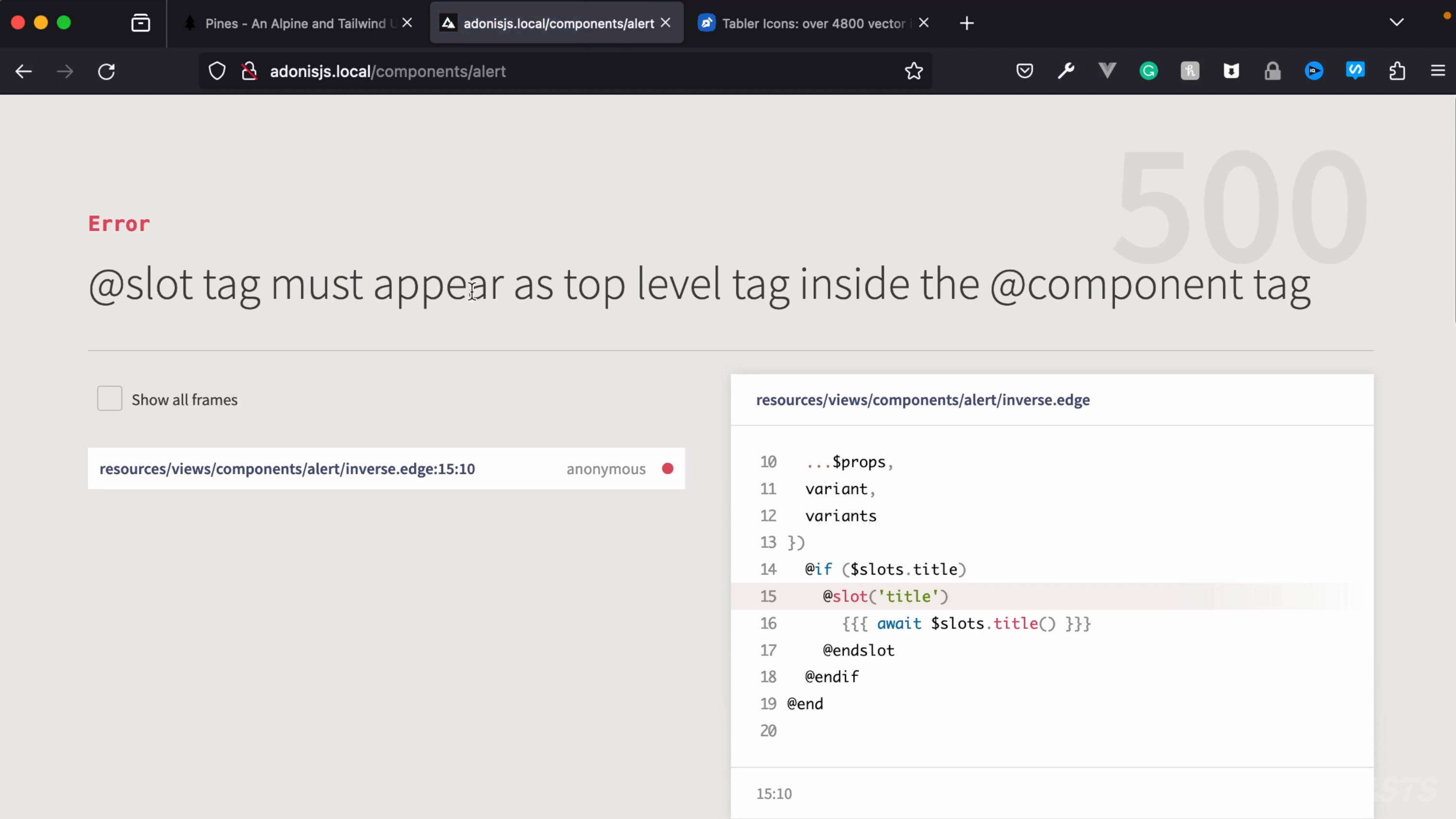
Unfortunately, this approach isn’t valid because slots must appear as top-level tags inside of the component, meaning our @if check around the slot will cause the error seen below.
How To Remedy This
One option we have to circumvent this error is to alter our base alert to allow $slots to be provided via the component’s $props. So, let’s go ahead and pass the $slots object from our inverse alert to the base alert it’s extending.
@set('variant', variant ?? 'blue') @set('variants', { blue: `border-transparent bg-blue-50 text-blue-600`, red: `border-transparent bg-red-50 text-red-600`, green: `border-transparent bg-green-50 text-green-600`, yellow: `border-transparent bg-yellow-50 text-yellow-600`, }) @!alert({ ...$props, variant, variants, $slots, })Copied!
- resources
- views
- components
- alert
- inverse.edge
Now, if we pause here and inspect(state) on our inverse alert, you should see something like the one below.

The first highlighted $slots are the slots defined for the base alert that our inverse alert is extending. The second highlighted $slots are the $props we’re passing from our inverse alert into our base alert.
Note that AdonisJS doesn’t merge the two or overwrite them in any way and our base alert only has a main slot while the slots passed into the base alert via $props has a main, icon, and title slot.
So, within our base alert, we can merge these two into a variable called slots (without the dollar sign), then replace all usages of $slots with slots.
@set('variant', variant ?? 'light') @set('variants', variants ?? { light: `bg-white text-neutral-900`, dark: `bg-black text-neutral-100`, blue: `border-transparent bg-blue-600 text-white`, red: `border-transparent bg-red-600 text-white`, green: `border-transparent bg-green-500 text-white`, yellow: `border-transparent bg-yellow-500 text-white`, }) @set('slots', { ...$slots, ...$props.$slots }) <div class="{{ variants[variant] }} relative w-full rounded-lg border p-4 [&>svg]:absolute [&>svg]:text-foreground [&>svg]:left-4 [&>svg]:top-4 [&>svg+div]:translate-y-[-3px] {{ slots.icon ? 'pl-11' : '' }}"> <div class="{{ variants[variant] }} relative w-full rounded-lg border p-4 [&>svg]:absolute [&>svg]:text-foreground [&>svg]:left-4 [&>svg]:top-4 [&>svg+div]:translate-y-[-3px] {{ $slots.icon ? 'pl-11' : '' }}"> @if (slots.icon) {{{ await slots.icon() }}} @if ($slots.icon) {{{ await $slots.icon() }}} @endif @if (title || slots.title) @if (title || $slots.title) <h5 class="mb-1 font-medium leading-none tracking-tight"> @if (title) {{ title }} @else {{{ await slots.title() }}} {{{ await $slots.title() }}} @endif Alert Message Headline </h5> @endif @set('mainSlot', await slots.main()) @set('mainSlot', await $slots.main()) @if (message || mainSlot) <div class="text-sm opacity-70"> @if (message) {{ message }} @else {{{ mainSlot }}} @endif This is the subtext for your alert message, providing important information or instructions. </div> @endif </div>Copied!
- resources
- views
- components
- alert
- index.edge
With that, any content passed via slots to our inverse alerts should successfully get rendered out, thanks to the prop cascading we’ve allowed above.
Adding Our Inverse Alert Demonstration
Lastly, before we move on to adding interactivity to our alerts, let’s add the demonstration for our inverse alert and its variants.
@layout.app({ title: request.params().name }) <h3 class="font-bold">Base Alert</h3> <div x-data class="mb-8 space-x-3 space-y-3"> @alert({ dismissable: true, selfDestruct: true }) @slot('icon') <svg class="w-4 h-4" xmlns="<http://www.w3.org/2000/svg>" width="24" height="24" viewBox="0 0 24 24" fill="none" stroke="currentColor" stroke-width="2" stroke-linecap="round" stroke-linejoin="round"><polyline points="4 17 10 11 4 5"></polyline><line x1="12" x2="20" y1="19" y2="19"></line></svg> @endslot @slot('title') Default, Base Alert @endslot This is our message! @end </div> <h3 class="font-bold">Variants</h3> <div x-data class="mb-8 space-y-3"> @alert({ variant: 'light' }) Light Alert @end @alert({ variant: 'dark' }) Dark Alert @end @alert({ variant: 'blue' }) Blue Alert @end @alert({ variant: 'red' }) Red Alert @end @alert({ variant: 'green' }) Green Alert @end @alert({ variant: 'yellow' }) Yellow Alert @end </div> <h3 class="font-bold">Inverse</h3> <div x-data class="mb-8 space-y-3"> @alert.inverse({ variant: 'blue' }) Blue Alert @end @alert.inverse({ variant: 'red' }) Red Alert @end @alert.inverse({ variant: 'green' }) Green Alert @end @alert.inverse({ variant: 'yellow' }) Yellow Alert @end </div> @endCopied!